Case 02PayPal

PayPal Developer Portal & AI Authorization

From 45k to 135k monthly developers — and +$1M merchant revenue.

Role
Senior UX Designer
Period
2021 — 2023
Location
Austin, TX
Tags
Developer Tools · AI
02PayPal
45k → 135k
Monthly portal visits
+$1M
Merchant revenue lift
+30%
Tool usage / quarter
−62%
Developer errors

Context

PayPal's developer audience spans solo integrators to enterprise platforms. The legacy portal optimised for documentation breadth, not first-integration success — and merchants in the US and EU were losing revenue to declined authorizations they couldn't diagnose or fix.

Problem

PayPal's developer portal was the front door for integrators, but discovery, onboarding and tool adoption were fragmented. Developers churned during integration; merchants lost revenue to declines they couldn't explain.

Developers tangled in a credentials maze
Opaque error responses as a black box

Approach

  1. 01

    Ran 30+ developer interviews, a competitive teardown of Adyen, Square and Stripe, and a diary study with SMB merchants.

  2. 02

    Mapped a single SMB × Developer journey to find the 7 moments that earn or lose trust.

  3. 03

    Redesigned the portal IA and shipped an in-product walkthrough; rebuilt credentials, webhooks and error surfaces.

  4. 04

    Designed an AI authorization-rate tool that explains every decline in plain language and proposes the fix.

Policy, model, and UI stitched as one system

Leadership & scope

Senior IC leading design across the Developer Portal redesign and the AI Authorization workstream. Embedded with Applied ML and the merchant-facing payments org; reported into the Director of Developer Experience.

Team

Direct: 2 designers + 1 content designer. Cross-functional: ~18 (eng, PM, applied ML, developer relations, localization).

Stakeholders

Director of Developer Experience, VP Payments, Head of Applied ML, regional merchant leads (US + EU), legal & compliance for AI explainability.

Mentorship

Coached 2 mid-level designers through the redesign; built a journey-mapping playbook adopted by the wider DevX org; ran weekly portfolio crits open to the broader design team.

Decisions I owned
  • 01

    Rejected a 'docs-first' homepage proposal — research showed developers wanted recent transactions and error logs at the door, not marketing copy. Defended this against marketing leadership.

  • 02

    Pushed Applied ML to expose model confidence and a plain-language reason on every declined transaction, instead of a generic 'try again' fallback. That decision is what unlocked the $1M revenue lift.

  • 03

    Forced a single design system across sandbox and live modes — eliminated the 'two dashboards' problem that had been a top-5 developer complaint for two years.

AI-specific design decisions

Trust ledger — AI proposes, human approves, system logs, merchant reviews
Pattern 01

Explain every decline in plain language

Problem

Merchants saw cryptic decline codes (e.g. 'DO_NOT_HONOR') with no path to remediation. Authorization rate was bleeding revenue silently.

Decision

Every decline surfaces a plain-language explanation, the model's confidence in that explanation, and a ranked list of fixes (retry timing, alt-funding, AVS tweak). Merchants can click any fix to simulate the rerun.

Trade-off

Required slowing down some checkout flows by 80–200ms to fetch the explanation; merchants overwhelmingly preferred the latency to the lost revenue.

Pattern 02

Confidence display without false precision

Problem

Showing '94.2% confident' implies a precision the model doesn't have, and invites merchants to argue against rounding.

Decision

Three-band confidence (High / Medium / Low) with a tooltip explaining what each band means and the historical accuracy of that band on the merchant's own traffic.

Trade-off

Loses fine-grained ranking inside a band; gained dramatically in trust and reduced 'why did your AI say…' support tickets.

Pattern 03

Human-in-the-loop on auto-retry rules

Problem

Auto-retrying declined transactions can violate network rules and trigger fines. Letting the AI do it autonomously was a non-starter for legal.

Decision

AI proposes retry strategies; merchant approves a policy (per BIN, per region, per amount band) once, then the AI executes within those bounds and logs every decision for audit.

Trade-off

Slower initial activation (merchants must read and accept policy), but turned a legal-blocked feature into a shippable one.

Pattern 04

Evaluation loop merchants can see

Problem

Merchants didn't trust an opaque AI deciding their revenue. Trust was the whole adoption barrier.

Decision

Built a weekly 'AI scorecard' surface: predictions made, accepted, overridden, and the resulting auth-rate delta vs. the no-AI control group on the same merchant's traffic.

Trade-off

Required running a permanent holdout cohort (slight revenue cost) — paid for itself by removing the 'is this even working?' objection in every renewal call.

Showreel

Showreel — end-to-end walkthrough of the new developer portal & AI authorization surface.

Research

Research

Before a single pixel moved, we ran 30+ developer interviews, a competitive teardown of Adyen, Square and Stripe, and a diary study with SMB merchants. The data made the brief: developers trusted PayPal the brand but distrusted the portal — and that gap was costing merchants real revenue.

Research
Finding 01

Where the old portal lost developers

  • Outdated design system65%
  • Confusing information architecture58%
  • Slow page performance42%
  • Accessibility gaps30%

Quantified from 30+ developer interviews and a heuristic teardown. The top two are design-fixable — the bottom two are tickets we filed with platform.

Finding 02

Where PayPal still won

  • Brand trust90%
  • Active developer forums54%
  • Recognized documentation as a weak spot47%
  • Willing to recommend to peers38%

Trust was the moat. Documentation was the leak — and the redesign concentrated on closing it without breaking the brand promise developers already believed in.

Competitive

Who set the bar — and where

CompetitorStrengthsWeakness
Stripe
DocsCode snippetsTime-to-first-call
Pricing complexity at scale
Square
SubscriptionsPOS integrationOnboarding
Limited global coverage
Adyen
Global coverageAuth ratesEnterprise tooling
Integration ease for SMBs
PayPal
Brand trustMerchant basePayouts breadth
Dashboard & developer surface

Stripe set the bar on documentation. Square owned subscriptions. Adyen led on global coverage. PayPal had to out-design all three on the dashboard surface.

Themes

Two themes ran through every interview

API quality & velocity
/ PERFORMANCE

API quality & velocity

Developers measured us in time-to-first-API-call, error rates and how fast we shipped fixes. Anything that slowed them down — including the portal itself — was a tax on our reputation.

Developers as decision-makers
/ TRUST

Developers as decision-makers

Developers weren't just implementers — they were the ones recommending payments providers to SMB founders. Earning their trust was earning the merchant.

These two themes became the lens for every prioritization call: if a feature didn't measurably move Performance or Trust, it didn't ship.

Goals

Seven measurable goals

01
−35%
Time-to-market for new integrations
02
Testing-tool adoption per developer
03
Monthly portal traffic
04
+30%
Developer tool usage per quarter
05
−62%
Developer integration errors
06
+$1M
Merchant authorization revenue lift
07
AA
WCAG compliance across portal surfaces

Each goal mapped to a single owner and a quarterly checkpoint. The 3× traffic and +$1M revenue lift became the project's North Star metrics.

Journey

Two journeys. One map.

01
Research
  • · Compare providers
  • · Evaluate docs
  • · Match developer
02
Pre-Integrate
  • · Create app
  • · Get keys
  • · Scope project
03
Integrate
  • · Sandbox tests
  • · First call
  • · Webhook setup
04
Post-Integrate
  • · Go live
  • · Monitor
  • · Diagnose
Two journeys. One map.
7 moments that earn or lose trust
1
Choosing a provider
2
Finding the right doc
3
Generating sandbox keys
4
First successful call
5
Wiring webhooks
6
Switching to live
7
Diagnosing a 500

End-to-end journey across SMB actions, developer–SMB interactions and developer actions. The seven numbered moments are where the redesign concentrated its budget.

Opportunities

Four How-Might-We bets

Four how-might-we cards on a desk
Opportunities clustered on a strategic map
HMW · 01

How might we match SMBs with the right developer at the right moment?

Developer–SMB matching surface inside the portal.

HMW · 02

How might we make integration complexity visible up front?

Effort-and-scope estimator on every product page.

HMW · 03

How might we let merchants explore checkout visually before they commit?

Interactive checkout sandbox with live previews.

HMW · 04

How might we give developers a scoping tool their PMs trust?

Shareable project scope with auto-generated estimates.

Each HMW pinned to a specific pain point — each one became a feature workstream that landed inside the year.

Before & after

Before & after

Before
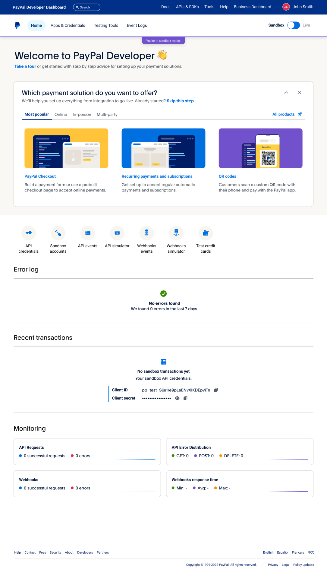
Before redesign — Landing → Dashboard. The old apps & credentials page asked developers to read marketing copy before getting to keys. The redesign opens with a personalised welcome, recent transactions, error logs and monitoring — the four things developers actually return for.
After
After redesign — Landing → Dashboard. The old apps & credentials page asked developers to read marketing copy before getting to keys. The redesign opens with a personalised welcome, recent transactions, error logs and monitoring — the four things developers actually return for.

Landing → Dashboard. The old apps & credentials page asked developers to read marketing copy before getting to keys. The redesign opens with a personalised welcome, recent transactions, error logs and monitoring — the four things developers actually return for.

Before
Before redesign — Webhooks events, before & after. The legacy table buried failures inside dense sidebar navigation. The new design surfaces status, response time and a resend action in one row — 37% more developers used the tool within a quarter.
After
After redesign — Webhooks events, before & after. The legacy table buried failures inside dense sidebar navigation. The new design surfaces status, response time and a resend action in one row — 37% more developers used the tool within a quarter.

Webhooks events, before & after. The legacy table buried failures inside dense sidebar navigation. The new design surfaces status, response time and a resend action in one row — 37% more developers used the tool within a quarter.

Process

How we built it

    / STEP 01

    Developer journey mapping

    Mapped merchant authorization workflows end-to-end, identified friction points in onboarding, and built empathy maps and personas to align product, research and engineering on the highest-leverage developer moments.

    / STEP 02

    Portal redesign + guided walkthrough

    Streamlined the developer portal IA and built an in-product walkthrough so developers could learn and try new features without leaving context. Shipped in 4 months — traffic grew from 45,000 to 135,000 monthly visits.

    / STEP 03

    AI authorization tool

    Designed an AI-driven tool that surfaces why a transaction was declined and how to fix it — improving merchant authorization rates and lifting revenue by $1M for US and EU merchants. Led the AI chat app that cut payment processing time by 14% and added $230k in revenue.

    / STEP 04

    Tooling adoption

    Iterated on developer tools with usability testing and analytics — usage rose 30% in a single quarter while developer-side errors dropped 62%.

Problem space

Where the portal was leaking trust

Developers measured the brand by the dashboard, not the marketing site. Buried errors, dense webhooks and unclear sandbox-to-live transitions were costing both adoption and merchant revenue.

Strengths to protect

What we could not break

Brand trust and an active developer community were the foundations. The redesign had to modernise the surface without disrupting the credibility developers already gave PayPal.

Storyboard · 10 frames

Ten frames

How the redesign moved the work, scene by scene.

Mapping two journeys at once
01 — Research
30+ interviews

Mapping two journeys at once

SMB merchants and the developers who serve them never lived on the same map. We synthesised 30+ interviews into one shared journey — and found the seven moments where the portal could earn trust or lose it.

Where developers used to land
02 — Before
Days → minutes

Where developers used to land

A dense marketing page with no clear path to keys, sandbox or working code. Time-to-first-API-call averaged days, not minutes.

A welcome that does the work
03 — After
45k → 135k / mo

A welcome that does the work

Solution-led entry: pick what you're building, get the right SDK, sandbox and guide in one screen. Traffic 3×'d in a quarter.

Credentials, demystified
04 — Sandbox
12 features · 1 surface

Credentials, demystified

One-screen sandbox: live keys, return URLs and 12 feature toggles with plain-language explanations beside each switch.

From sandbox to production
05 — Go live

From sandbox to production

A clear, colour-shifted live mode with the same mental model — so developers never relearn the dashboard when revenue starts flowing.

Errors, surfaced not buried
06 — Observability
−62% errors

Errors, surfaced not buried

Error log moved from a 4-click hunt to the home dashboard. Time-to-diagnose fell sharply.

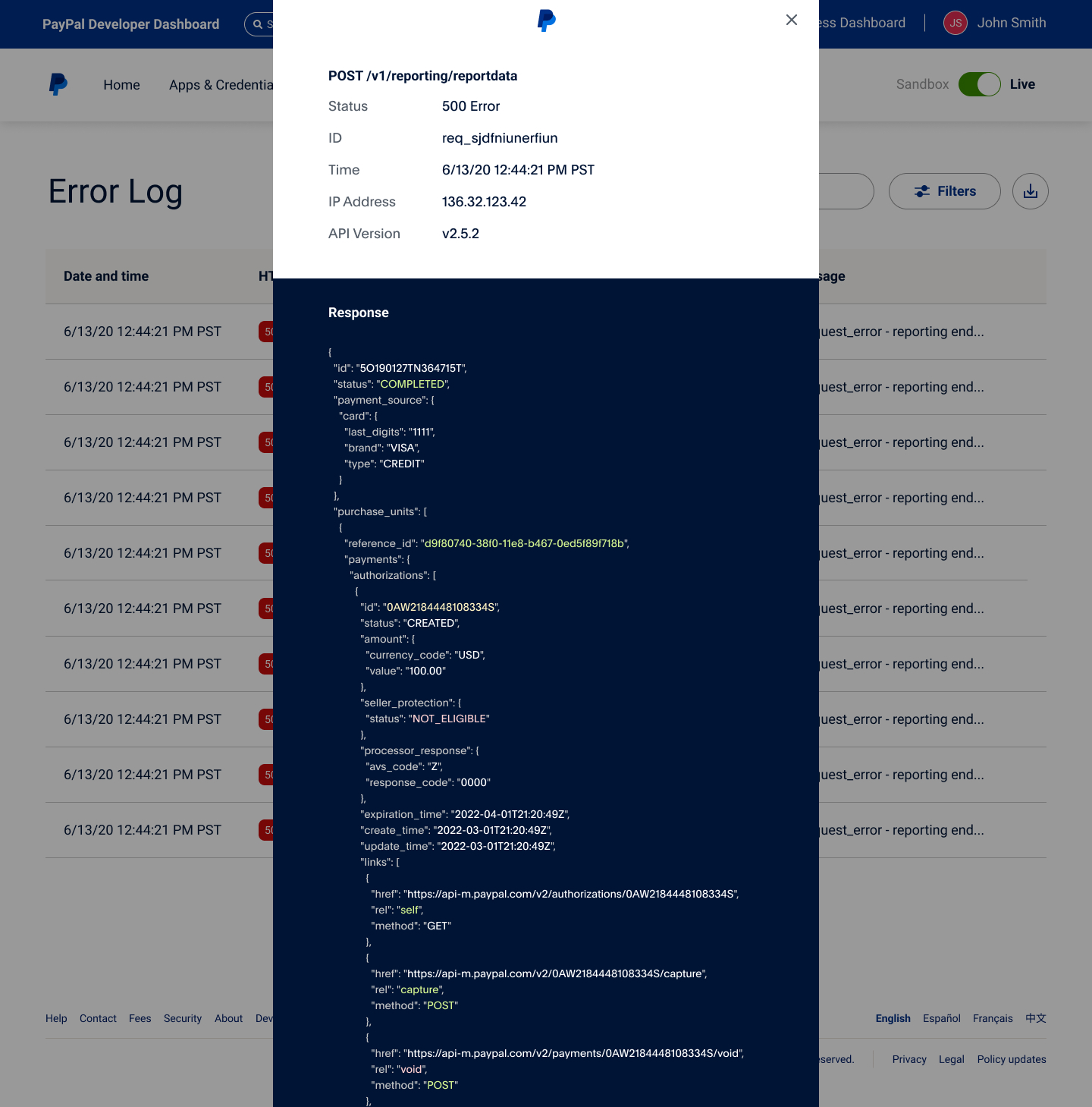
AI explains the 500
07 — AI diagnostic
+$1M revenue

AI explains the 500

Click any failure and get the full request, the response and an AI-written explanation of what to fix — lifting auth rates by enough to add $1M in merchant revenue.

API health at a glance
08 — Analytics

API health at a glance

Twelve months of request volume and error rate, filterable per app. The chart is the headline; the table is the proof.

Reward the calm
09 — Healthy state

Reward the calm

When nothing is on fire, the dashboard quietly cross-sells the next product — payouts, subscriptions, online checkout.

One responsive system
10 — Design system

One responsive system

Every screen above is built from the same tokens, grid and components — shipped across XXL → S in one library.

Gallery

Selected screens

Gallery

End-to-end developer experience

Journey map through dashboard, sandbox, live, observability and the AI diagnostic.

01 — End-to-end SMB × Developer journey map
02 — Before: fragmented legacy developer site
03 — After: redesigned developer welcome surface
04 — App credentials · sandbox mode
05 — App credentials · live mode
06 — Dashboard with live error log
07 — AI-assisted error diagnostic drilldown
08 — API request & error analytics
09 — Healthy state · cross-sell surfaces
10 — Responsive design system & checkout components

Outcomes

What shipped, and what changed.

01

Monthly developers nearly tripled — 45k → 135k in the first four months.

02

Estimated +$1M merchant revenue lift attributed to the AI authorization tool.

03

Developer tool usage up 30% in a single quarter, sustained across regions.

04

Developer integration errors down 62%; AA WCAG compliance across portal surfaces.

Senior UX
Vinoth Kumar Manickam
Product
Developer Experience
Applied ML
Authorization AI team